 how-to
7 Steps to Choose Event Backdrop Colors for Branding
Last Updated: November 7, 2026
Quick Summary
Start with your official brand color guidelines and use your primary brand color as the dominant backdrop shade, adding a secondary color or neutral for accents. Then test those event backdrop colors under the venue's actual lighting and through a phone camera before approving them.
- Pull HEX, RGB, and CMYK codes from your brand guidelines before looking at fabrics.
- Use one dominant brand color, one or two supporting tones, and white, black, or gray for contrast.
- Match the backdrop mood to the event type, such as bold colors for launches and rich tones for galas.
- Test swatches under venue lighting, including stage spots, with flash on and off and auto white balance.
- Aim for at least a 4.5:1 contrast ratio between the logo and the backdrop color.
Table of Contents
- Why Backdrop Color Matters for Brand Recognition
- Step 1: Pull Your Brand Color Guidelines Before Choosing Anything
- Step 2: Build a Palette Using Brand Color Palette Examples
- Step 3: Apply Branding Colors Psychology to Match Event Mood
- Step 4: Test Colors Under Venue Lighting and Camera Conditions
- Step 5: Generate and Check Your Palette with a Brand Color Palette Generator
- Step 6: Plan Logo Placement and Check Legibility
- Booking Your Backdrop Drapes with Event Drape Rental
- Frequently Asked Questions
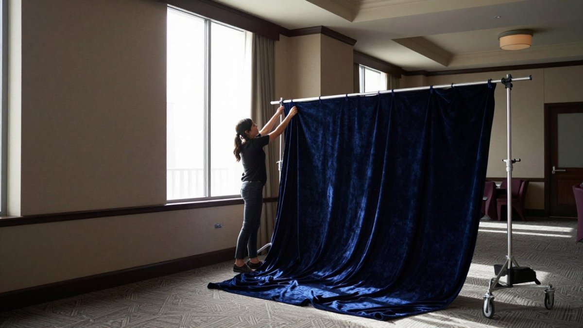
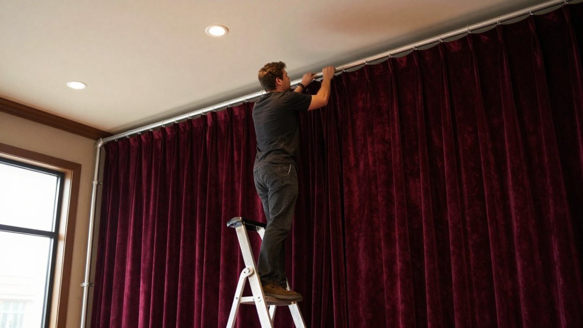
Your event backdrop is often the first thing guests see and the last thing they photograph. For a brand event, that makes event backdrop colors a branding decision, not just a decor choice. The color choices that work best tend to follow a clear process. Here, we walk through seven steps to choose event backdrop colors for branding, from pulling your brand guidelines to planning where your logo will sit.
Why Backdrop Color Matters for Brand Recognition
A backdrop fills more of the frame than almost anything else in an event space. Speakers, step-and-repeat areas, and photo walls all rely on it. When the color matches your brand, people connect the event to your company without needing a logo to shout it.
Many planners find that the backdrop tends to shape how attendees remember the event. A strong, consistent color makes your brand recognizable in every photo. A weak or mismatched one gets lost, especially once guest photos hit social media.
Here is the core idea we will build on: your backdrop colors should reinforce your brand identity first and suit the event second.
Step 1: Pull Your Brand Color Guidelines Before Choosing Anything
Start with your official brand color guidelines. Do not guess from memory or from the company logo on a slide deck.
Look for these details in your guidelines:
- Primary colors: the main brand colors used most often
- Secondary colors: supporting shades for accents
- Color codes: HEX, RGB, and CMYK values for each shade
- Usage rules: any colors that must never be paired or placed on certain backgrounds
Write down the exact shade names and codes before you look at fabric options. Matching a code is far easier than matching a color by eye.
Watch out: If your brand has no written guidelines, pull the colors from your logo file and confirm them with your marketing team before you rent anything.
Step 2: Build a Palette Using Brand Color Palette Examples
Once you have your brand colors, build a small working palette. Most event backdrops work best with one dominant color and one or two supporting tones.
Look at how other brands use color. Many companies pair a bold primary with white, black, or a neutral gray. This keeps the backdrop readable and lets the logo stand out.
A simple structure many planners use:
- Dominant: your primary brand color, covering most of the backdrop
- Supporting: a secondary brand color or neutral for panels or accents
- Contrast: white, black, or gray to set off logos and text
Brand color palette examples can help you test these combinations on paper before committing.
Step 3: Apply Branding Colors Psychology to Match Event Mood
Colors carry feelings. Branding colors psychology is the practice of choosing shades that suit the mood you want the event to create. Warm tones like red and gold tend to feel energetic and celebratory. Cool tones like blue and teal often feel calm and corporate. Black and deep neutrals usually feel formal and premium.
Match the mood to the event type:
- Product launch: bold, high-contrast colors that draw the eye
- Corporate gala: deep, rich tones with metallic or velour texture
- Client appreciation: softer neutrals with one accent color
- Trade show booth: clean, consistent colors that read well from a distance
Here's where it gets practical. A color can look right on a swatch and wrong on a stage. That is why the next steps matter as much as this one.
Step 4: Test Colors Under Venue Lighting and Camera Conditions
This is the step most planners skip, and it is where colors often go wrong. Lighting changes everything. A deep navy under warm amber lights can look black. A bright white can look yellow under some bulbs. Most practitioners find that the gap between a fabric swatch in daylight and the same fabric on stage is larger than expected, so test under the conditions guests will actually see.
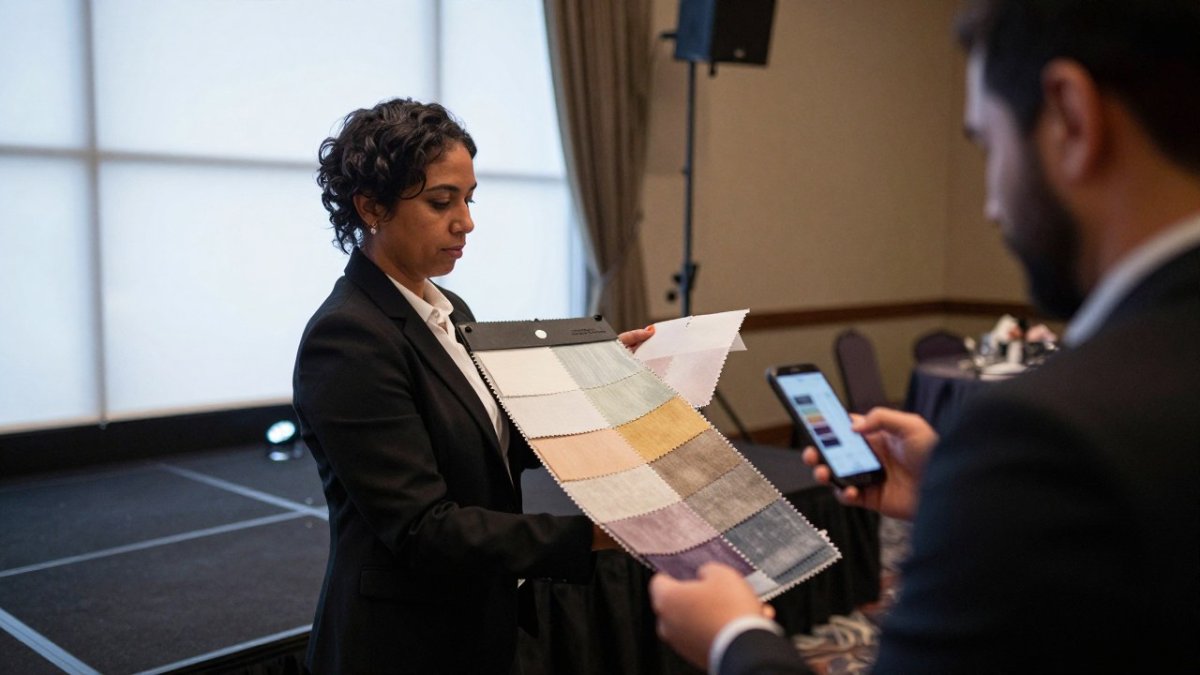
Start by asking the venue three questions: what is the color temperature of the house lighting (warm 2700K-3000K, neutral 3500K-4000K, or cool 5000K+), will any stage spots or colored washes hit the backdrop, and can you access the space for a walkthrough. If you cannot visit, request a photo of the room with the event lighting on and note the camera and settings used.
Then run a realistic test with the tools guests will use:
- Hang or hold each fabric swatch where the backdrop will sit, not in a hallway or office.
- Turn on the event lighting, including stage spots and any colored washes.
- Take photos with a phone camera at default settings from the spot where guests will stand, then repeat with flash on and off.
- Take one photo with white balance set to auto and one with it locked to the venue's color temperature.
- Compare each photo to your brand color code and note any shift in hue, saturation, or brightness.
A common pattern is that warm house lighting pushes blues toward green and makes whites look cream, while cool lighting can make reds look flat. Flash often exaggerates sheen and can wash out metallic finishes. Locking white balance to the venue's color temperature gives the most predictable result, but guests will shoot on auto, so check both.
Test fabrics before you commit, because a fabric that looks perfect in daylight can shift under stage lights.
Watch out: A swatch that matches your brand code under office lighting can fail the venue test, so never approve a color without seeing it under the event's actual lighting and through a phone camera.
The article's lighting checklist shows how colors can shift once they reach the venue, so compare the key conditions below.
| Lighting condition | Likely effect | What to do |
|---|---|---|
| Warm house lighting (2700K-3000K) | Blues shift toward green; whites look cream | Test swatches under the venue's actual lights |
| Cool lighting (5000K+) | Reds can look flat | Lock white balance to the venue's color temperature |
| Flash on | Exaggerates sheen; washes out metallics | Take photos with flash both on and off |
| Phone camera at default settings | Guests shoot on auto white balance | Check both auto and locked white balance |
| Daylight swatch check | Can differ from stage lighting | Approve colors only under event lighting |
Step 5: Generate and Check Your Palette with a Brand Color Palette Generator
A brand color palette generator can speed up the matching process. These tools take your primary color and suggest complementary, analogous, or neutral pairings. They are useful for narrowing your options, not for final decisions. Use the strongest pairings as a starting point, then align them with an effective event branding strategy so the backdrop supports the broader visual identity.
Use a generator to:
- Test complementary pairs such as blue with orange or purple with yellow
- Check how a shade looks next to white and black
- Confirm that your chosen colors have enough contrast
After generating options, check them against your brand guidelines again. A generator might suggest a shade that looks good but does not match your official code. Trust your guidelines first.
Step 6: Plan Logo Placement and Check Legibility
Your backdrop should make your logo easy to read from across the room and in photos. Plan where the logo will sit before you finalize colors, because legibility is a design problem as much as a color problem.
Start with contrast. A dark logo needs a light backdrop, and a light logo needs a dark one. For accessibility, aim for a contrast ratio of at least 4.5:1 between the logo and the backdrop color, which is the WCAG AA threshold for normal text and a useful proxy for logo visibility. You can check this with a free contrast checker by entering the HEX codes for your logo and backdrop.
Next, plan scale and spacing. A logo that reads well on a laptop screen can disappear on a 20-foot wall. As a rule of thumb, the logo height should be at least 1/10 of the backdrop height for step-and-repeat walls, and repeat spacing should leave clear space equal to at least half the logo width on all sides. For a 12-foot backdrop, that means a logo around 14 inches tall with 7 inches of clear space.
Consider sightlines and where people stand. Logos placed at eye level (roughly 60-66 inches from the floor) read best in photos, but guests often stand in front of the center of the wall. Place key branding off-center or repeat it so at least one instance stays visible when someone stands in the middle. For photo walls, leave a clear zone at standing height and put the densest branding above or below it.
Fabric finish matters too. Matte fabrics reduce glare, while metallic or sheen finishes can reflect light and wash out text. A common mistake is choosing a backdrop that matches the brand but makes the logo blend in. Check legibility with a printed logo sample held against the fabric at the actual distance guests will stand. If the logo disappears, adjust the shade or the logo colorway.
Watch out: A backdrop can pass a color match and still fail legibility if the logo is too small or placed where guests block it, so test the full composition with a person standing in the frame.
Booking Your Backdrop Drapes with Event Drape Rental
Once your palette is set, you are ready to book. Event Drape Rental offers pipe and drape in heights from 12 to 30 feet, with more than 100 colors across six fabric materials. Many planners choose a DIY setup, while others prefer professional installation for larger events.
To see the full range of heights, colors, and materials, visit the Event Drape Rental website. Pricing depends on quantity, rental dates, and delivery location, so request a quote for current rates. When you are ready, submit a request for a quote (RFQ) and our team will help you match your brand colors to the right materials.
Frequently Asked Questions
How do I pick colors for branding on an event backdrop?
Start with your brand's primary and secondary colors from your brand color guidelines, then choose one as the dominant backdrop tone. Use a secondary color for accents and keep a neutral such as white, black, or gray for balance. Always test a fabric swatch under the venue's lighting, because colors shift under warm or colored stage light. Confirm that your logo stays readable against the final choice before you commit to a rental order.
What is the 70/20/10 rule for event backdrop colors?
The 70/20/10 rule assigns roughly 70 percent of the visual space to a dominant color, 20 percent to a secondary color, and 10 percent to an accent. For a backdrop, the dominant color is usually the drape itself, the secondary color appears in florals, lighting, or signage, and the accent is a logo or trim detail. Applying this ratio keeps the design from competing with your brand mark and gives photographs a clear focal point.
Should an event backdrop use brand colors or neutral colors?
Brand colors work best when your logo must stand out and the event is customer-facing, such as a trade show booth. Neutral tones like white, black, or gray suit galas and conferences where the content or speakers should lead, and they let brand accents carry the identity. Bold brand colors can overwhelm a logo, so pair them with a neutral base unless the brand color is already a deep, low-saturation shade.
How can I make a logo stand out against an event backdrop?
Choose a backdrop color with strong contrast to your logo's main color, since high contrast makes marks readable from across a room and in photos. Avoid placing a light logo on a light backdrop or a dark logo on a dark one. Keep the logo at eye level and surround it with clear space, so the drape pattern or texture does not compete with the mark.