 blog
Seven Color Combinations for Elegant Event Backdrops
Last Updated: October 29, 2026
Quick Summary
The best event backdrop colors depend on the mood, season and venue lighting. Ivory, champagne and antique gold suit formal weddings, while charcoal, white and brass suit corporate events. Test each palette under the venue's actual lights before you order.
- Backdrop color sets the mood of the room and dominates event photos.
- Choose the palette around one fixed element such as florals, linens, or brand color.
- Warm lighting pushes ivory and blush toward yellow; cool light pushes blush toward gray.
- Dark backdrops suit guests in light clothing; light backdrops suit guests in dark clothing.
- Event Drape Rental offers drapes from 12 to 30 feet in over 100 colors.
Table of Contents
- Why Backdrop Color Matters More Than You Think
- How to Choose Event Backdrop Colors Before You Shop
- Seven Event Backdrop Color Ideas for Elegant Spaces
- Wedding Backdrop Colors by Venue and Season
- Step and Repeat Backdrop Colors for Photo-Ready Displays
- Lighting, Contrast, and Legibility Checks
- Request Your Backdrop Color Quote from Event Drape Rental
- Frequently Asked Questions
Why Backdrop Color Matters More Than You Think
Your backdrop is the first thing guests see and the last thing in most event photos. Color sets the mood before anyone speaks. A deep navy wall reads formal and quiet. A blush or sage panel reads soft and romantic. Choose poorly and even expensive flowers can look washed out.
Across weddings and corporate events, the same room can feel like a gala or a cafeteria depending on the drape color. That is why backdrop color is worth treating as a design decision, not an afterthought.
- Color shapes the mood of the whole room
- Backdrops dominate photos, so they set how the event looks online
- The right color makes décor and florals look more expensive
How to Choose Event Backdrop Colors Before You Shop
Start with the venue, not the swatch book. Look at the lighting, the floor, and any existing wall or ceiling colors. A warm amber-lit ballroom will change how ivory and champagne look compared with a bright white tent.
Next, decide what the backdrop needs to do. Is it a photo wall, a stage frame, or a room divider? A photo backdrop needs contrast with skin tones and clothing. A stage backdrop can be more subtle.
Finally, bring one fixed element to the planning meeting, such as the florals, the linens, or the brand color. Match your backdrop to that anchor so the palette feels planned.
Quick checklist before you choose:
- Note the venue's lighting type and color temperature
- Identify the one design element you cannot change
- Decide if the backdrop is for photos, staging, or both
- Confirm your count of panels and height needed
Seven Event Backdrop Color Ideas for Elegant Spaces
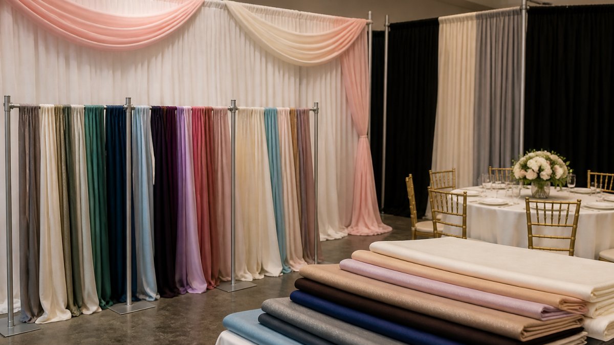
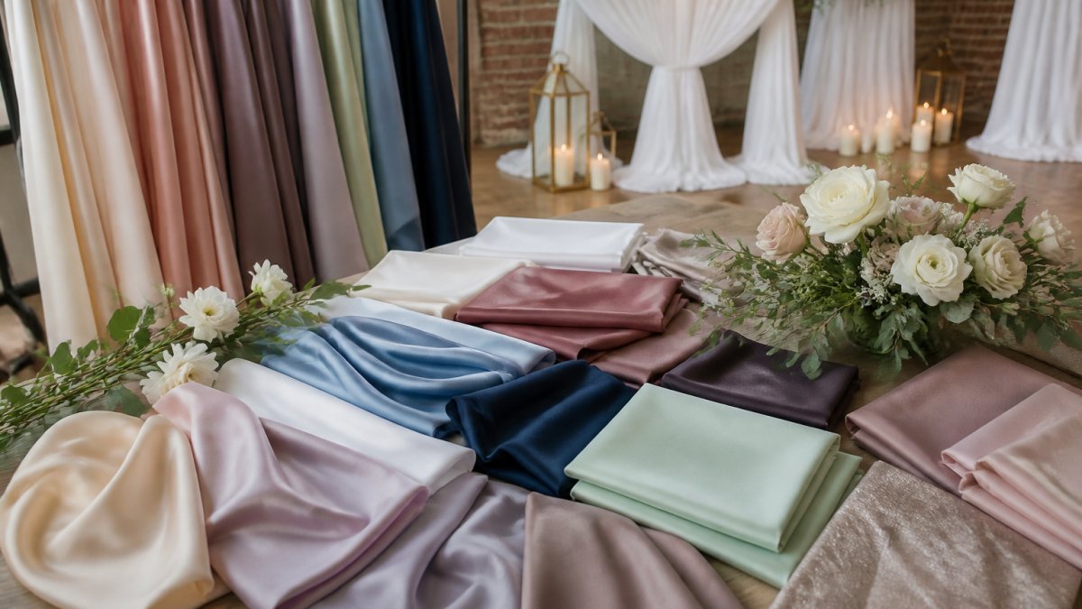
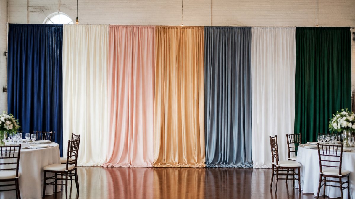
These seven combinations work across weddings, galas, and corporate events. Each one pairs a dominant base color with a supporting tone and a single accent so the room reads intentional rather than decorated. Use the descriptions below as a starting point when you request fabric swatches, and pair each palette with the lighting notes further down.
1. Ivory, Champagne, and Antique Gold
This is the most requested palette for formal weddings and black-tie galas. Ivory (a warm off-white, not a cool bright white) keeps the background soft, champagne adds a subtle warmth that photographs well under tungsten and warm LED, and antique gold brings shine without looking flashy. It flatters most skin tones and pairs cleanly with white, cream, or blush florals. Use ivory as the main drape, champagne as a secondary panel or valance, and antique gold only in trim, chair accents, or uplighting so the metallic does not overwhelm the camera.
2. Black, Sapphire, and Metallic Accents
Black creates strong contrast and makes lighter florals and metallic details pop. Sapphire adds depth and reads richer than navy under dim evening lighting, while a chrome or gold trim keeps the look from feeling heavy. This works well for evening galas, corporate awards dinners, and any event with a stage and spotlights. Keep black as the dominant backdrop, sapphire as a secondary panel or sash, and reserve metallics for signage frames and table accents.
3. Sage, Blush, and Dusty Blue
This softer trio suits garden weddings, daytime receptions, and spring corporate luncheons. Sage grounds the palette, blush adds romance, and dusty blue keeps it from becoming too sweet. Use it in spring and early summer when the venue has natural light. Sage works best as the main panel, blush as an accent drape or table runner, and dusty blue in smaller doses such as napkins or signage so the palette stays airy rather than muddy.
4. Navy, Burgundy, and Rose Gold
A deeper, moodier option for fall and winter events. Navy reads formal and quiet, burgundy adds richness, and rose gold warms the whole composition so it does not feel cold. This palette holds up well in ballrooms with warm amber lighting and in venues with dark wood floors. Navy as the base, burgundy as a secondary panel, and rose gold in chargers, flatware, or signage frames. Visualizing these textures and metallic accents before the installation begins helps to create luxury mood boards that ensure every element of the design remains cohesive.
5. Emerald, Ivory, and Brushed Gold
Emerald is one of the few jewel tones that reads equally elegant in daylight and under evening lighting. Paired with ivory it stays fresh rather than heavy, and brushed gold (less reflective than polished gold) keeps the metallic from competing with the green. This works for holiday parties, engagement parties, and any event where you want a jewel-tone look without going full black-and-gold. Emerald as the main drape, ivory as a secondary panel or table linen, brushed gold in accents.
6. Blush, Mauve, and Soft Silver
A romantic, low-contrast palette for weddings and bridal showers. Blush and mauve sit close together on the color wheel, so the effect is tonal rather than graphic, and soft silver adds a cool counterpoint that keeps the palette from reading too pink. This combination photographs beautifully in natural light but can flatten under cool LEDs, so test it on site. Blush as the base, mauve as a secondary panel, silver in chargers, frames, or lighting fixtures.
7. Charcoal, White, and Brass
A modern, architectural palette for corporate events, product launches, and minimalist weddings. Charcoal provides contrast without the heaviness of black, white keeps it crisp, and brass adds warmth. This is the most legible palette for step-and-repeat backdrops and signage because the contrast between charcoal and white is high enough to read from across a room. Charcoal as the main drape, white as a secondary panel or logo panel, brass in frames and hardware.
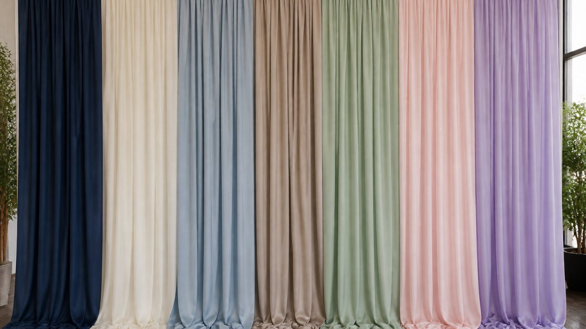
The seven palettes differ in mood, season and how well they hold up under venue lighting. This table sums up the main points for each.
| Palette | Best for | Key note |
|---|---|---|
| Ivory, Champagne, Antique Gold | Formal weddings, black-tie galas | Warm off-white; gold only in trim |
| Black, Sapphire, Metallic Accents | Evening galas, awards dinners | High contrast; metallics on frames |
| Sage, Blush, Dusty Blue | Garden weddings, spring luncheons | Airy; dusty blue in small doses |
| Navy, Burgundy, Rose Gold | Fall and winter events | Warm amber rooms; rose gold warms it |
| Emerald, Ivory, Brushed Gold | Holiday and engagement parties | Jewel tone; brushed gold stays subtle |
| Blush, Mauve, Soft Silver | Weddings, bridal showers | Low contrast; test under cool LEDs |
| Charcoal, White, Brass | Corporate events, product launches | Most legible for step-and-repeat |
Wedding Backdrop Colors by Venue and Season
Venue and season should guide your final choice. Indoor ballrooms with warm lighting work well with champagne and deep jewel tones. Outdoor tents in bright sun need lighter fabrics so the backdrop does not look dark or dull.
For fall weddings, many planners lean toward burgundy, plum, and warm gold. For winter events, ivory and silver tones feel crisp. Summer calls for sage, blush, and soft blue.
- Ballroom (warm lighting): champagne, antique gold, deep jewel tones
- Outdoor tent (daylight): ivory, sage, dusty blue
- Fall events: burgundy, plum, warm gold
- Winter events: ivory, silver, sapphire
Step and Repeat Backdrop Colors for Photo-Ready Displays
A step-and-repeat backdrop is judged by the camera, not the eye. Choose colors that separate your guests from the background. Dark navy and black work well for guests in light clothing. Ivory and blush suit guests in darker outfits.
Avoid busy patterns that compete with logos or names. Solid fabric keeps the focus on the people and the branding. If your event has a logo, check that it stands out against the chosen color before the event day.
Lighting, Contrast, and Legibility Checks
Lighting can shift a backdrop color several shades, and the shift is predictable enough to plan around. Test your fabric under the venue's actual lights during a site visit, and if a site visit is not possible, ask the venue for the color temperature of their house lighting and compare swatches under a bulb of the same rating. Explore custom fabric ceiling treatments that can frame the backdrop under your event lighting.
Contrast matters as much as hue. For a photo backdrop, the goal is to separate guests from the background. Dark backgrounds (navy, charcoal, black, emerald) work well when guests are likely to wear light clothing; light backgrounds (ivory, blush, sage) work well when guests are likely to wear dark clothing.
For signage and logos, legibility is a contrast problem, not a color problem. As a practical rule, light text on a dark backdrop or dark text on a light backdrop reads from the back of the room; mid-tone text on a mid-tone backdrop does not, no matter how elegant the palette.
A simple pre-event check: photograph a person standing in front of the backdrop under the venue's lighting, then review the image on a phone. If the person's outline is clear and any text is readable at thumbnail size, the palette and contrast are working.
Request Your Backdrop Color Quote from Event Drape Rental
Once you have picked a palette, the next step is getting accurate pricing. Event Drape Rental offers drapes from 12 to 30 feet tall in over 100 colors and six fabric materials. Pricing depends on quantity, rental dates, and delivery, so request a quote with your exact color choices.
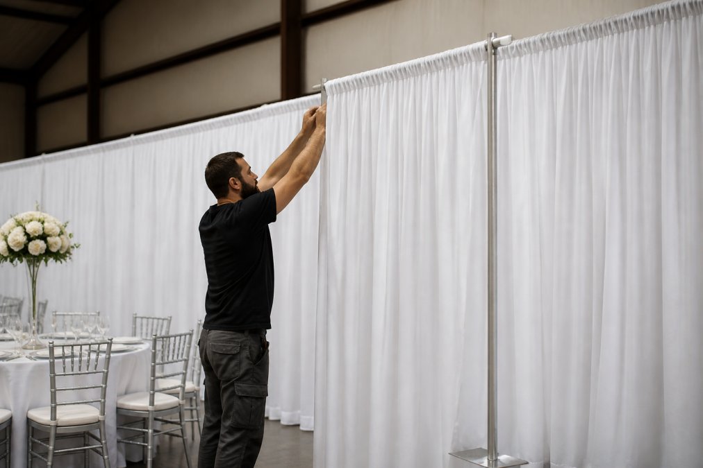
You can also choose between DIY installation and professional installation. Request your backdrop color quote today.
Frequently Asked Questions
What colors look elegant together for an event backdrop?
Neutral pairings such as ivory with champagne, or black with antique gold, tend to read as elegant because they stay restrained while still feeling formal. Jewel tones like sapphire or emerald work well when paired with metallic accents. Keep the palette to two or three main tones so the backdrop does not compete with florals, centerpieces, or lighting. Test each combination under your venue's actual lighting before committing, since warm and cool bulbs shift fabric colors noticeably. Request swatches from your rental provider so you can compare colors side by side.
How do I choose a backdrop color for my event?
Start with the event's existing palette, such as brand colors for a corporate gala or the wedding's florals and linens. Choose a backdrop that either complements those colors or serves as a calm neutral that lets them stand out. Consider the venue's walls, floor, and lighting, because a dark backdrop can disappear in a dim room. Photograph a sample swatch in the space to check how it looks on camera. Confirm the color is available in the fabric you need before finalizing your plan.
What backdrop colors work best for weddings?
Ivory, champagne, blush, and sage are popular for weddings because they photograph softly and suit most seasons. Deep plum or burgundy works well for fall ceremonies, while dusty blue or sapphire suits evening receptions. White and ivory backdrops are easy to coordinate with most floral arrangements, which keeps the ceremony look cohesive. Ask your photographer which backdrop tones they prefer, since camera settings and skin tones can change how a color appears in photos.
How many colors should an event backdrop have?
Most elegant backdrops use one dominant color with one or two accent colors. Three colors total is a practical limit for most events, since more than that can make the space feel busy and harder to coordinate. A single fabric color with metallic trim or contrasting drape edges can add depth without overwhelming the design. For step-and-repeat displays, a solid background in one color keeps logos and branding easy to read.