 blog
Best Wedding Drape Colors for Modern Themes
Table of Contents
- Wedding Drape Colors That Define Modern Aesthetics
- Wedding Drape Color Combinations for Contemporary Elegance
- Wedding Backdrop Color Ideas by Venue Type
- How to Choose Wedding Drape Colors for Your Theme
- Popular Modern Wedding Drape Color Palettes
- Practical Considerations for Drape Selection and Installation
- Frequently Asked Questions
Last Updated: October 6, 2026
Wedding Drape Colors That Define Modern Aesthetics
Today's couples expect wedding drape colors that reflect their personal style while creating Instagram-worthy moments that feel intentional, not formulaic.
Couples are drawn to curated palettes, mixing metallics with muted tones, layering textures, and using color to tell their story.
The best color choices aren't about trends, they're about how color, light, and fabric work together in your venue. A palette that looks stunning in a downtown loft might feel flat in a garden.
This guide covers the palettes that define modern wedding aesthetics, how to choose colors for your theme and venue, and the practical considerations that separate a polished result from a disappointing one.
Wedding Drape Color Combinations for Contemporary Elegance
The most sophisticated modern weddings use intentional color combinations. Contemporary elegance is restraint paired with strategic accents that elevate the space.
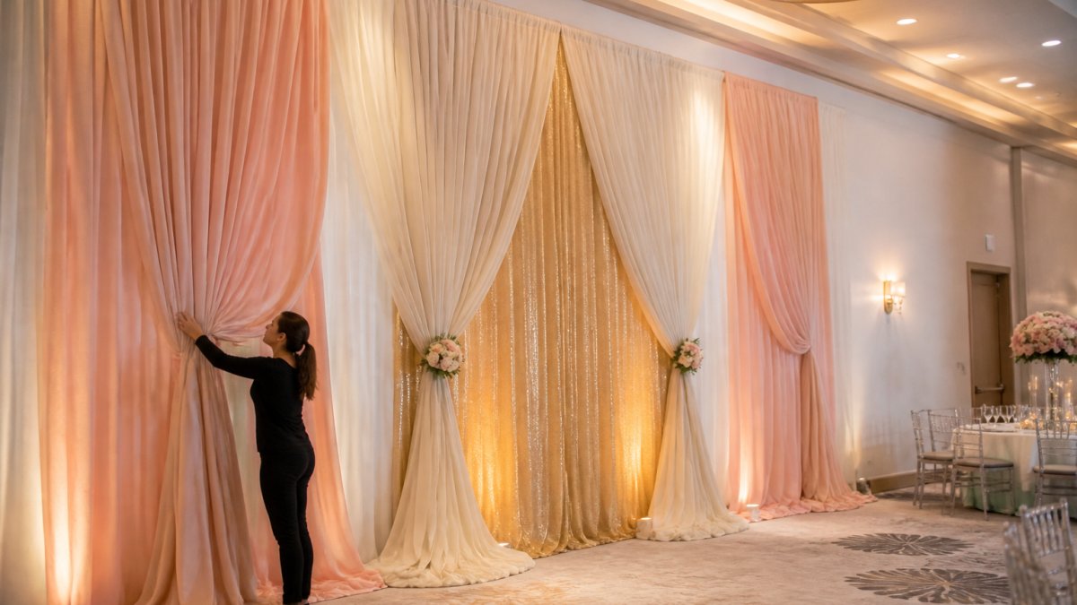
Neutral and Soft Palettes
Neutral combinations remain the foundation of modern wedding design because they're versatile and timeless. But modern neutrals aren't boring beiges.
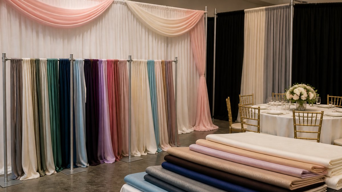
The most effective neutral palettes layer multiple shades for depth. Ivory with champagne and soft taupe creates visual interest without clashing, while blush pink with ivory and warm white adds femininity without feeling saccharine.
A common mistake is treating all neutrals as interchangeable. Ivory under warm lighting reads completely different from ivory under cool LED, and blush pink that feels romantic in daylight can look washed out under fluorescent light. See your drape colors in the actual venue lighting before committing.
Bold and Jewel-Tone Combinations
Modern couples increasingly embrace jewel tones, deep emerald, sapphire blue, burgundy, and rich plum, best paired with neutrals or metallics to prevent the space from feeling dark.
Deep green with ivory creates a botanical, garden-inspired feel indoors or out. Navy blue with gold accents evokes sophisticated glamour. Burgundy with blush pink creates a moody, romantic atmosphere that photographs exceptionally well.
Jewel tones need adequate lighting to avoid looking murky: a warehouse with large windows can handle deep emerald beautifully, while a windowless ballroom might need uplighting to make the same color sing.
Metallic and Accent Pairings
Gold, silver, and rose gold accents are essential to modern wedding design, working as secondary colors layered with neutrals or as primary accents against deeper tones.
Gold with ivory and blush creates warmth and luxury. Silver with white and gray feels contemporary and clean. Rose gold with blush and champagne creates a softer, romantic aesthetic. Metallics catch light and add dimension solid colors alone cannot achieve.
Wedding Backdrop Color Ideas by Venue Type
Your venue dictates which colors will actually work, a palette that's stunning in one setting can fall flat in another.
Ballroom and Indoor Venues
Ballrooms offer controlled lighting and neutral walls, giving you freedom with color choice, though warm undertones affect how colors read.
Soft palettes, ivory, champagne, blush, and pale gold, complement ballroom architecture without competing, while deep jewel tones work with uplighting for dimension. Avoid colors that match the walls exactly; drapes should create contrast and define the space.
Ballrooms with exposed brick, dark wood, or contemporary art call for lighter drapes that create visual separation and feel like a design element, not an extension of the walls.
Outdoor and Garden Settings
Natural light is both your biggest ally and biggest challenge outdoors, since colors shift dramatically as the sun moves and clouds pass overhead.
Soft neutrals, ivory, champagne, and pale blush, photograph beautifully in natural light and complement gardens without competing with flowers. White can look stark at midday but romantic at golden hour, and pale green pairs naturally with botanical settings. Avoid very dark colors; they look heavy and absorb light rather than reflect it.
One practical consideration: wind. Lighter fabrics move more noticeably, which can be beautiful or distracting, while heavier linens hold color better and move more subtly.
Industrial and Converted Warehouse Spaces
Warehouse venues have high ceilings, concrete walls, and often large windows or skylights, demanding color that contrasts against gray and neutral backgrounds.
Deep jewel tones, emerald, sapphire, burgundy, look sophisticated against industrial architecture, while blush and ivory create warmth in cool spaces. Gold and rose gold accents add luxury, and black and gold creates Gatsby-inspired elegance.
High ceilings and open layouts absorb darker colors beautifully without the space feeling closed-in.
How to Choose Wedding Drape Colors for Your Theme
Selecting the right wedding drape colors requires a systematic approach. Random choices, however beautiful individually, often clash when combined in a space.
Starting with Your Wedding Theme
Your theme anchors which palettes will work. Modern themes fall into several categories, each with natural color affinities.
Minimalist modern weddings use white, ivory, gray, and black with minimal accents. Contemporary romantic themes layer soft neutrals with blush, champagne, and rose gold. Modern bohemian themes incorporate sage green, dusty blue, and warm metallics.
The mistake most couples make is choosing colors they love individually without considering how they'll work together. A beautiful blush pink and a stunning emerald green might clash rather than complement. Your theme provides the framework that makes color choices cohesive.
Considering Fabric, Opacity, and Texture
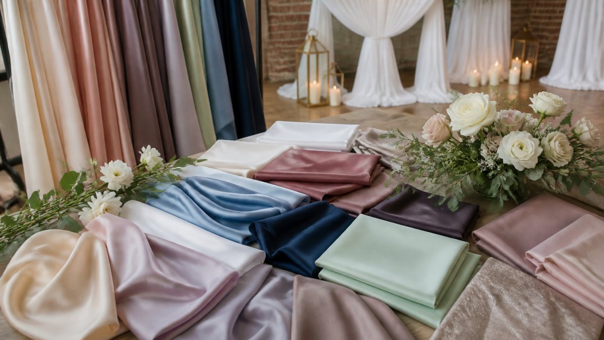
Fabric choice affects how color appears. Sheer fabrics read lighter and more delicate; linen and heavier materials show color more richly; velvet and textured fabrics add dimension flat fabrics cannot.
Opacity matters significantly. Sheer drapes layered over solid backings create depth and allow light through. Opaque drapes make a bold statement and define spaces. Transparent drapes work beautifully for ceremony backdrops; opaque drapes work better for intimate spaces or hiding unsightly areas.
Texture adds sophistication: smooth linens feel contemporary, velvet feels luxurious, and layered fabrics create visual interest. Event Drape Rental offers 6 different fabric materials, each with distinct visual and tactile qualities. Choose fabric that aligns with your theme and venue aesthetic.
Accounting for Natural and Artificial Lighting
This is where most couples struggle, and where the difference between a mediocre result and a stunning one becomes apparent.
Natural light shifts throughout the day: morning light is cool and blue-toned, midday is bright and neutral, and golden hour is warm and flattering. Your drape colors will read differently at each time.
Artificial lighting affects color perception dramatically. Warm white bulbs enhance gold, blush, and ivory. Cool white or blue-toned lighting makes jewel tones pop but can make warm neutrals look yellow.
The practical solution: visit your venue at the time your event will occur, bring fabric samples in your palette, and see how they look in actual lighting.
Popular Modern Wedding Drape Color Palettes
These palettes have proven successful across different venues and themes. They're not trends that will feel dated in five years, they're foundational combinations that work because of how colors complement each other.
Minimalist Whites and Ivories
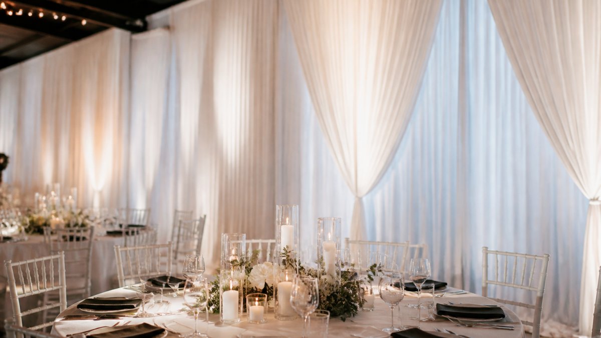
Pure white, ivory, cream, and champagne create a clean, contemporary aesthetic that works in every venue type and photographs beautifully. The sophistication comes from layering shades and adding subtle metallic accents.
White drapes with ivory accents and brushed gold hardware feel luxurious without being ornate. This works for minimalist modern, contemporary, and even traditional couples who want a clean aesthetic, letting florals, lighting, and linens shine.
Practical note: white shows wrinkles and dust more readily than darker colors. Professional installation and careful handling matter more with this palette.
Blush, Beige, and Muted Earth Tones
Soft pink, warm beige, taupe, and champagne create a romantic yet modern aesthetic that feels current without being trendy. It works beautifully in natural light and photographs with warmth and depth.
Blush with ivory and champagne creates a layered, sophisticated look; adding dusty sage or soft gray introduces complexity without jarring the palette. This works exceptionally well for garden venues and outdoor settings where natural tones complement the landscape.
Deep Greens and Botanical Accents
Sage green, emerald, and forest green paired with ivory or cream create a nature-inspired modern aesthetic, fresh and increasingly popular for couples who value sustainability and natural elements.
Emerald green with ivory and gold creates a jewel-box effect. Sage green with cream and rose gold feels softer and more romantic. Layering green drapes with floral garlands and greenery creates a cohesive botanical theme that feels intentional and elegant.
Black and Gold Gatsby-Inspired
Black drapes with gold accents create dramatic, luxurious elegance. This palette works best in indoor venues with good lighting. It feels bold and sophisticated without feeling heavy if executed properly.
Black with champagne, ivory, and rose gold creates a glamorous aesthetic. Adding metallic accents and uplighting prevents the space from feeling dark. This palette works beautifully for evening receptions and creates a high-impact backdrop for photos.
Practical Considerations for Drape Selection and Installation
Color choice is only half the equation. How drapes are installed, what fabrics are used, and how the space is lit determine whether your vision comes to life.
Fabric Options and Their Visual Impact
Different fabrics create different visual effects.
Event Drape Rental carries 6 different fabric materials because different fabrics serve different purposes. Pair your color choice with a fabric that enhances rather than detracts from your vision.
Ceiling Height and Vertical Coverage
Ceiling height determines how much vertical space you have to work with. Standard ballrooms have 12-14 foot ceilings; warehouses often have 20-40 foot ceilings.
Event Drape Rental offers drapes from 12 to 30 feet in height, covering spaces from intimate ballrooms to soaring warehouses. Use height strategically: drapes that reach the floor create a finished, intentional look, while drapes that stop short feel incomplete.
In spaces with very high ceilings, layering drapes at different heights creates visual interest and prevents the space from feeling cavernous. A single 30-foot drape in a 40-foot warehouse might feel sparse; layered drapes at 20 feet and 30 feet create depth and sophistication.
Installation Timeline and Professional Support
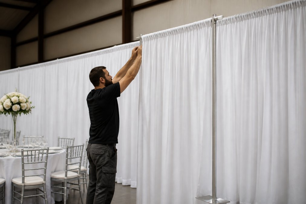
DIY installation is possible for smaller spaces and simpler setups. However, professional installation ensures drapes are hung correctly, evenly, and securely.
Installation timeline varies by space size and complexity.
Professional installers understand different ceiling types, how to hide hardware, and how to ensure drapes hang without wrinkles.
Event Drape Rental offers both DIY rental options and professional installation. For couples who want their vision executed flawlessly, professional installation removes uncertainty and guarantees results.
Choosing the right wedding drape colors transforms your venue from a blank canvas into a reflection of your personal style.
Event Drape Rental's inventory of over 100+ colors and 6 different fabric materials gives you the flexibility to execute any vision.
Frequently Asked Questions
What colors are popular for modern wedding draping?
Modern weddings favor soft, sophisticated palettes over bold, traditional colors. Whites, ivories, blush pinks, and warm beiges dominate contemporary designs. Deep jewel tones like emerald green and navy are gaining popularity for accent drapes. Metallics, especially gold and rose gold, pair well with neutral bases. The trend leans toward muted, natural tones that photograph well and create an elegant atmosphere without overwhelming the space.
How do you choose wedding drape colors that match your theme?
Start by identifying your wedding theme: minimalist, romantic, Gatsby-inspired, botanical, or contemporary. Pull your primary color from that theme, then select drape colors that either match or complement it. Consider your venue's existing colors and lighting conditions. Sheer fabrics in lighter tones work well for romantic themes, while heavier linens suit modern minimalist designs. Test color samples under your venue's actual lighting before committing, as artificial and natural light dramatically affect how colors appear.
How can lighting change the look of wedding drape colors?
Lighting is transformative. Warm white and gold lighting makes blush, ivory, and beige drapes appear softer and more romantic. Cool white lighting emphasizes crisp whites and silvers, creating a contemporary feel. Colored uplighting can shift how neutral drapes read, blue lighting makes beige appear cooler, while amber lighting warms it. Sheer fabrics show lighting changes more dramatically than opaque linens. Always view drape colors under your venue's actual lighting setup, including both ambient and accent lighting, to ensure they match your vision.
What fabric is best for modern wedding draping?
Modern weddings typically use high-quality fabrics for clean, structured looks. Sheer materials allow light to pass through, creating depth and dimension. Other materials offer a more tailored, contemporary appearance and photograph well. Your choice depends on your theme and venue. Fabric weight also affects how drapes hang and move.