 listicle
How to Choose Seasonal Color Trends for Wedding Backdrops
Last Updated: November 10, 2026
Quick Summary
Choose seasonal color trends for wedding backdrops by starting with the season's dominant tones, then testing the fabric under your venue's actual lighting. Spring favors soft pastels, summer brights, fall plum and rust, and winter jewel tones. Use the season as a starting point, not a rule.
- Spring palettes lean on butter yellow, soft lavender, pale lilac, and dusty sage.
- Fall palettes include plum, merlot, fig, and olive, according to Pinterest's 2026 report.
- Sage green appears in a large share of 2026 palettes, per the Zola First Look Report.
- Test your chosen shade in the venue at the time of day your event starts.
- Use one dominant backdrop color, roughly 60 percent of the visual area, with supporting and accent colors.
Table of Contents
- How Seasonal Color Trends Shape Wedding Backdrops
- Spring Wedding Colors: Soft Pastels That Hold Up in Daylight
- Summer Wedding Colors: Brights, Citrus and Garden Greens
- Fall Wedding Colors: Plum, Merlot, Olive and Warm Rust
- Winter Wedding Colors: Jewel Tones and Deep Neutrals
- How Lighting, Fabric and Venue Change Your Backdrop Colors
- Choosing Your Backdrop Palette and Requesting a Quote
- Frequently Asked Questions
Spring weddings are moving toward soft pastels, while summer leans brighter and fall turns to plum and rust. For couples and planners, the backdrop is often the largest color field in the room, so the palette you pick there sets the tone for every photo. This guide walks through how seasonal color trends apply to wedding backdrops, from fabric choice to lighting.
Paperlust's 2026 palette guide names butter yellow, soft lavender, pale lilac, and dusty sage as leading spring colors. Pinterest's 2026 Wedding Trends Report describes a different direction: couples gravitating toward plum, merlot, fig, and olive. Both trends are real, and a backdrop is where you decide which one fits your event.
Seasonal color trends are shifting. Couples are increasingly mixing soft garden pastels with quiet neutrals and jewel tones rather than committing to one palette. Use the season as a starting point, not a rule.
How Seasonal Color Trends Shape Wedding Backdrops
A wedding backdrop is a large, flat field of color that sits behind the couple, the ceremony, or the head table. Seasonal trends influence which shades feel fresh and which feel dated. Planners who understand the season's dominant tones can choose a backdrop that looks current without overwhelming the room.
Trend data points in several directions at once. Sage green appears in a large share of 2026 palettes according to the Zola First Look Report. Warm, sunset-inspired hues such as peach, rust, and burnt orange are also gaining ground for both summer and autumn events.
The practical question is how a trend translates to fabric. A color that reads well on a screen can look flat under warm venue lighting, and a deep jewel tone can absorb light in a dim ballroom. Test your chosen shade in the actual venue before committing.
Spring Wedding Colors: Soft Pastels That Hold Up in Daylight
Spring palettes lean on soft, luminous pastels. Butter yellow, soft lavender, pale lilac, and dusty sage are the shades most often named for 2026 spring weddings, according to Paperlust.
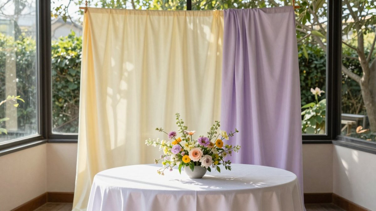
Pastels show their best color in daylight. Under bright sun they can look almost white, which is useful for a clean, airy ceremony. Under overcast skies or in a dim hall, the same fabric can turn gray or muddy, so check the backdrop at the time of day your event starts.
A common mistake is pairing several pastels at equal strength. Choose one dominant pastel for the backdrop and use the others in flowers and linens. This keeps the backdrop from competing with the rest of the décor.
Summer Wedding Colors: Brights, Citrus and Garden Greens
Summer weddings support more saturated color.
Bright backdrops suit outdoor and open-air venues, where natural light is strong. In full sun, a vivid color can wash out in photos if the fabric has a glossy finish, so matte or velour materials often photograph more evenly.
Avoid stacking too many bright colors on one backdrop. One saturated color, paired with a neutral or white accent, usually reads as intentional. Several competing brights tend to look busy.
Fall Wedding Colors: Plum, Merlot, Olive and Warm Rust
Fall palettes move toward deeper, earthier tones. Pinterest's 2026 Wedding Trends Report describes couples gravitating toward plum, merlot, fig, and olive. Warm rust and burnt orange add warmth to the same palette.
These colors suit evening events and indoor venues with lower light. Deep fabrics need enough illumination to show their richness, so plan uplighting or warm spotlights for the backdrop area. Without light, a plum drape can read as black. Integrating Essex Light Up Numbers alongside these dark tones creates a luminous focal point that balances the heavy velvet textures while providing a structural anchor for a custom balloon garland.
Pairing matters here. Olive and rust work well together, and plum sits comfortably beside blush or champagne accents. Choose the backdrop first, then select flowers and linens that complement it.
Winter Wedding Colors: Jewel Tones and Deep Neutrals
Winter weddings typically favor jewel tones and deep neutrals. Emerald, sapphire, and deep red provide rich backdrops for formal evening receptions.
Neutrals such as black, charcoal, and ivory offer a more restrained alternative. They anchor a room, make flowers and metallic décor stand out, and photograph cleanly in candlelit settings.
Consider texture alongside color. A velour or heavy-weight fabric in a jewel tone adds depth that a thin material cannot match, especially under low light.
How Lighting, Fabric and Venue Change Your Backdrop Colors
The same backdrop can look like two different colors depending on three variables: the light falling on it, the fabric covering it, and the room around it. Planning for the backdrop means testing the swatch under the conditions the photographs will actually be taken in.
Lighting. Color temperature is the first variable to pin down. Warm incandescent or 2700K-range lamps push pastels toward cream and deepen blues and greens toward teal. Neutral 4000K lighting is closer to daylight and shows a palette most faithfully. Cool 5000K-plus LED lighting can make butter yellow look chalky and lavender look gray. Ask the venue for its lamp types and, if possible, the color temperature of the spot or uplight that will hit the backdrop, since that light often differs from the general room lighting. Uplighting or spotlighting a backdrop can dominate its appearance, so the spotlight color matters.
Fabric. Finish changes perceived hue. Matte and velour surfaces tend to diffuse light and show pigment more evenly. Satin and high-gloss fabrics can reflect the light source directly, creating hot spots and shifting hue with viewing angle. Sheer or lightweight fabrics let the wall or stage behind them show through, which can turn a blush into a beige. When you compare fabrics, hang swatches at the same height and under the same light, not flat on a table.
Venue. Surfaces around the backdrop act as secondary light sources. A white ballroom bounces light back onto the fabric and lifts every color; a dark-paneled room absorbs it and pushes medium shades toward muddy. Ceiling height matters too, because a backdrop hung high in a tall room reads differently from one at eye level. Note the floor, since a dark floor directly in front of a pale backdrop can cast a shadow line in candid photos.
A simple test. Hang your chosen fabric in the venue, photograph it at the time of day the event starts using the same white balance you expect the photographer to use, and view the photo on a phone and on a laptop. Compare the result against the swatch in daylight. Watch out: a camera's auto white balance can shift a pastel backdrop noticeably warmer or cooler than the eye sees, so set a fixed white balance or ask the photographer to do so before the event.
The same backdrop can look different depending on the light, fabric and room, so these factors are worth checking before you commit.
| Factor | What changes | Practical note |
|---|---|---|
| Lighting (2700K warm) | Pastels shift toward cream; blues and greens toward teal | Ask for the lamp color temperature |
| Lighting (5000K+ LED) | Butter yellow can look chalky; lavender can look gray | Cool light shifts shades noticeably |
| Matte or velour fabric | Diffuses light and shows pigment evenly | Tends to photograph more consistently |
| Satin or gloss fabric | Creates hot spots and shifts hue with viewing angle | Reflects the light source directly |
| Sheer fabric | Lets the background show through | A blush can turn beige |
| White ballroom | Bounces light back and lifts colors | Helps pastels stay bright |
| Dark-paneled room | Absorbs light and pushes shades toward muddy | Medium shades can turn muddy |
Choosing Your Backdrop Palette and Requesting a Quote
A seasonal palette becomes usable once each color is given a job. For a backdrop, a common and workable split is roughly 60 percent dominant, 30 percent supporting, and 10 percent accent, measured by the visual area each color occupies in the frame rather than by how many colors you pick. The backdrop itself is almost always the dominant color, because it is the largest continuous field in most photographs.
Dominant (the backdrop). Pick one color for the fabric. In a spring palette this is usually the softest pastel, such as dusty sage or pale lilac. In a fall palette it is often a deep earthy tone such as olive or merlot. Because the backdrop fills the frame, it should be the color you have tested under real lighting.
Supporting (florals, linens, seating). Choose one or two colors that sit near the backdrop on the color wheel or are a lighter or deeper step of the same family. These carry the palette into the rest of the room without competing with the backdrop. A useful check is to lay the backdrop swatch next to the floral swatch in the same light and confirm the two still read as a pair.
Accent (signage, candles, metallics). Reserve the most saturated or contrasting color for small items. Accents work best when they are limited to a few touches; too many make the room look busy.
Signage and text. If your ceremony or reception includes text placed over a patterned or floral backdrop, check contrast before you print. Light text on a pale backdrop, or dark text on deep velour, can disappear in photographs. Place text on a solid panel where possible, and test legibility at phone-screen size, since many guests will view the photos on phones.
Requesting a quote. When you are ready to move from planning to ordering, send your event date, venue, the backdrop color you have tested, and the approximate footprint. Pricing depends on quantity, dates, and delivery, so request a quote to confirm figures. Our request for quote form takes these details in one submission. For wedding-specific drape services, see our wedding events page.
Frequently Asked Questions
What colors are trending for wedding backdrops this year?
Current 2026 reporting points to soft spring pastels such as butter yellow, soft lavender, pale lilac and dusty sage, along with moody nature tones like plum, merlot, fig and olive. Because trends shift quickly, check current palette guides before you lock in a color, and confirm that the fabric you want is available in your chosen shade.
What are the best wedding backdrop colors for each season?
Spring favors pastels like butter yellow, pale lilac and mint green. Summer leans toward brighter shades such as coral, turquoise, tangerine and garden green. Fall suits plum, rust, burnt orange and olive. Winter works well with jewel tones like emerald, deep red and sapphire, paired with ivory or cream. Choose the season that matches your date, then test two or three shades against your venue lighting before deciding.
What colors work best for a spring wedding backdrop?
Soft spring backdrops often use butter yellow, pale pink, mint green, powder blue and dusty sage. These colors read clearly in daylight and pair well with pastel florals. Avoid very pale fabrics in bright sun, where they can wash out in photographs. A slightly deeper tone of the same color often photographs better than the lightest option.
How do you choose a wedding color palette for a backdrop?
Start with the venue lighting and the season, then pick one anchor color for the backdrop and one or two supporting colors for flowers and linens. Order a fabric sample under your venue's lighting before committing. Event Drape Rental can help you compare swatches and request a quote for the exact shade you need.