 listicle
Best Color Options for Event Backdrops
Table of Contents
- Best Color Options for Event Backdrops
- Jewel Tones for High-End Events
- Neutral Palettes for Professional Corporate Event Color Palette Ideas
- Metallic Fabrics and Accent Colors
- Best Backdrop Colors for Photography
- Avoiding Wrinkled Drapes for Event Rentals
- Color Theory and Lighting Considerations
- Seasonal Backdrop Trends and Color Psychology
- Frequently Asked Questions
Last Updated: September 1, 2026
Best Color Options for Event Backdrops
Choosing the right backdrop color affects photography output, attendee perception, brand recognition, and overall professional aesthetics. The challenge is finding the right color for your specific event, a jewel tone that photographs beautifully under stage lighting might feel too dark in natural daylight, while a neutral backdrop that works for corporate events may lack visual interest for a wedding.
Quick Picks:
- Best for High-End Events: Jewel tones (emerald, sapphire, burgundy) create drama and sophistication
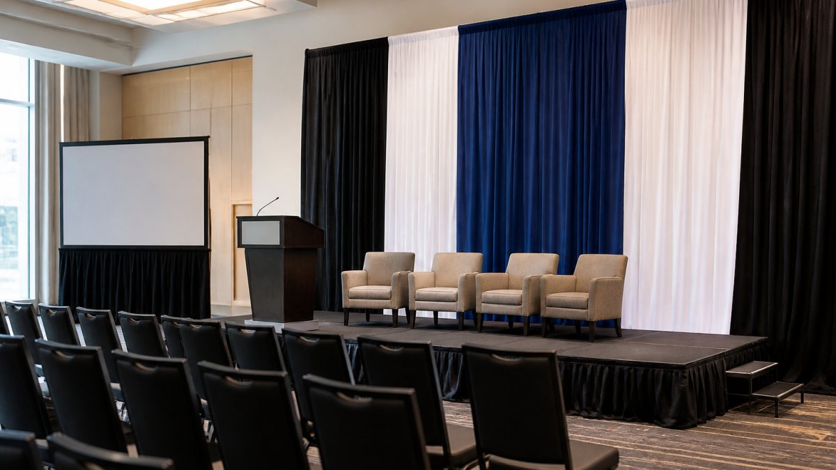
- Best for Corporate Settings: Neutral palettes (charcoal, soft gray, white) maintain professional aesthetics and brand focus
- Best for Photography: Soft neutrals or matte finishes provide clean contrast without hot spots
- Best for Visual Impact: Metallic fabrics and accent colors add dimension and catch light beautifully
Jewel Tones for High-End Events
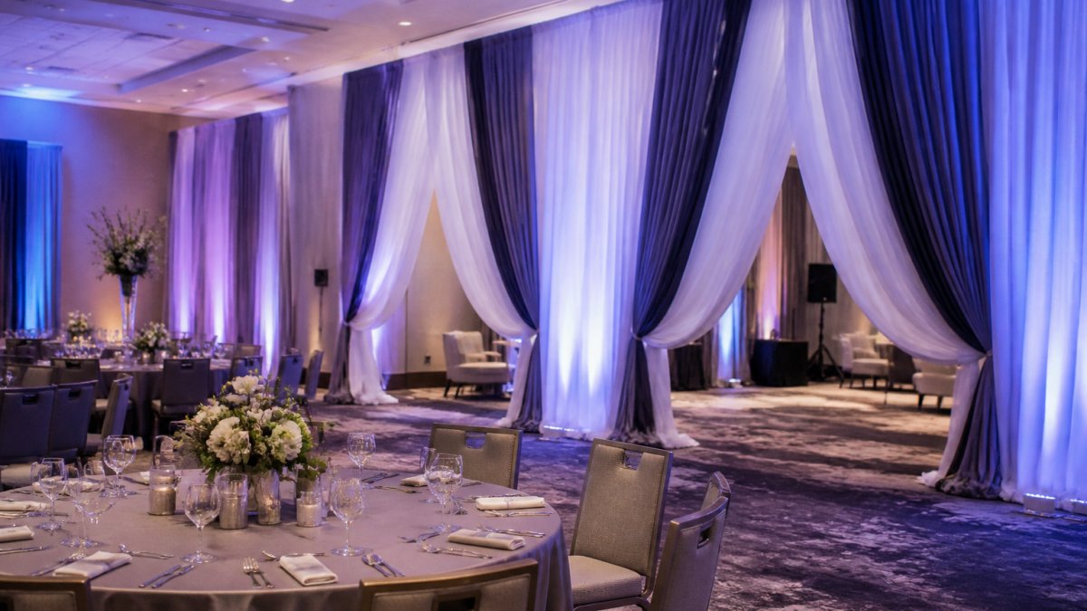
Jewel tones, deep emerald, sapphire blue, rich burgundy, and amethyst, create an immediate sense of luxury and sophistication. These colors work particularly well for gala events, upscale weddings, and high-profile corporate functions where you want attendees to feel the occasion is special.
What makes jewel tones effective is their saturation and depth. Unlike bright primary colors, jewel tones photograph exceptionally well under professional lighting, creating visual interest without appearing garish. The psychology matters too: these colors trigger associations with wealth, exclusivity, and refinement, making attendees subconsciously perceive an event as more premium.
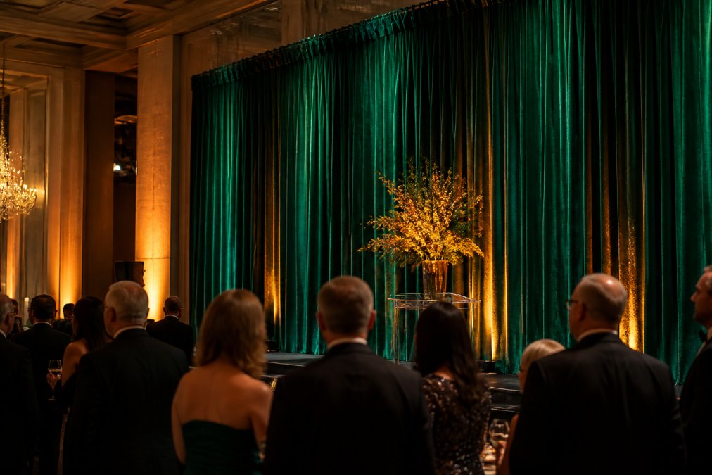
Jewel tones pair exceptionally well with metallic accents. Gold, silver, or copper lighting or fabric trim amplifies the high-end feel. Event Drape Rental offers jewel-tone options in velvet and matte finishes, each creating different effects depending on your lighting setup. Velvet creates a rich, three-dimensional appearance, while matte finishes provide a more subdued, elegant look.
One limitation: jewel tones require adequate lighting. In poorly lit venues or outdoor daytime events, they can appear dull. For indoor galas and evening events, jewel tones are nearly unbeatable.
Neutral Palettes for Professional Corporate Event Color Palette Ideas
Neutral backdrops, charcoal gray, soft gray, beige, and white, dominate corporate settings because they work. They keep focus on your brand, speakers, or products rather than competing for attention. When your goal is to present information or build credibility, a neutral backdrop removes visual noise.
Charcoal gray has become the de facto standard for professional corporate events. It's darker than light gray, photographs cleanly without appearing washed out, and provides enough contrast for speakers to stand out while maintaining a serious, professional tone. It also hides wrinkles better than light colors and works across different lighting conditions.
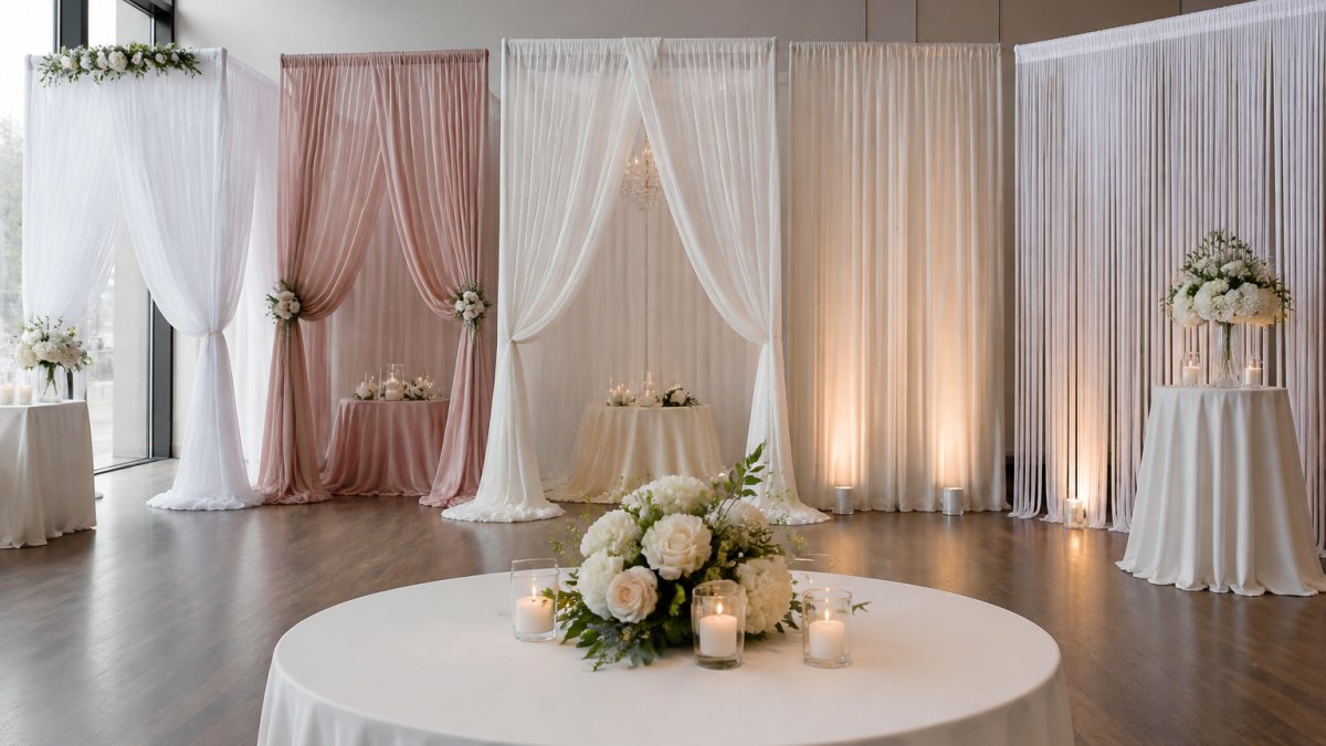
Soft gray offers a contemporary, clean middle ground, lighter than charcoal but more interesting than white. For brand-heavy corporate events, consider whether your brand colors complement a neutral backdrop. A vibrant logo will pop against neutral gray or white.
Event Drape Rental's neutral options come in matte and glossy finishes. Matte finishes are preferred for corporate settings because they eliminate hot spots and reflections that distract from presentations.
Metallic Fabrics and Accent Colors
Metallic fabrics, gold, silver, copper, and rose gold, add dimension and catch light in ways solid colors cannot. These materials work best as accent drapes or primary backdrops in settings where you want visual drama without the intensity of jewel tones.
Metallic fabrics create a modern, high-energy aesthetic. Silver works beautifully for tech events and contemporary weddings. Gold feels warm and celebratory, ideal for galas. Copper and rose gold have become increasingly popular for their trendy appeal and ability to complement both warm and cool color schemes.
The key is understanding how metallics interact with lighting. Metallic fabrics are reflective, they bounce light rather than absorb it. Under stage lighting, a silver backdrop creates sparkle and visual interest. Accent colors work alongside your primary backdrop to create visual hierarchy. A charcoal gray primary backdrop with gold accent drapes creates a sophisticated palette that feels intentional.
Combining metallics with jewel tones creates striking effects. An emerald backdrop with silver or gold trim feels both luxurious and contemporary.
Best Backdrop Colors for Photography
Photography output should heavily influence your color choice. What looks good in person doesn't always translate to photos.
The best backdrop colors for photography are those that create contrast with your subjects without overwhelming them. Soft neutrals, light gray, warm beige, off-white, provide clean contrast for portrait photography and work across different skin tones and clothing colors.
Matte finishes are superior to glossy for photography. Glossy surfaces create hot spots that wash out detail and are difficult to correct in post-processing. Matte finishes distribute light evenly, making the photographer's job easier and final images cleaner.
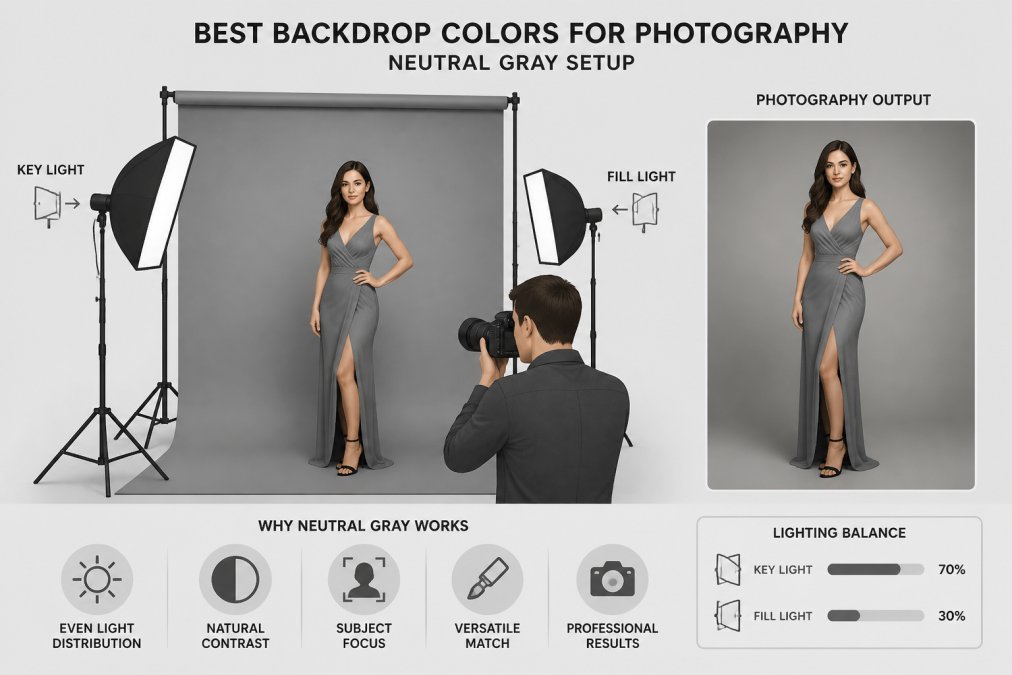
For event photography, consider how your backdrop will look behind speakers and award recipients. Mid-tone neutrals, charcoal gray, warm gray, soft taupe, hit the sweet spot. If using colored backdrops, ensure adequate contrast with your subjects. Lighting setup matters enormously; a backdrop that photographs poorly under overhead fluorescent lights might look stunning under professional stage lighting.
Avoiding Wrinkled Drapes for Event Rentals
Wrinkled drapes destroy an otherwise perfect aesthetic. Avoiding wrinkles requires understanding how fabrics behave and what you can control.
Fabric material matters significantly. Polyester and velvet hold creases stubbornly, while spandex and stretch fabrics naturally smooth out as they're hung (the FTC). Matte finishes show wrinkles more prominently than glossy finishes.
Delivery and storage are critical. Hang drapes immediately upon receipt rather than storing them folded. Proper installation prevents wrinkles from forming, drapes need to be weighted at the bottom and tensioned properly across the frame.
Steaming on-site is a practical solution for minor wrinkles. Commercial garment steamers can remove creases that developed during transport. The material choice directly impacts wrinkle visibility; matte polyester and spandex blends are more forgiving than velvet.
Color Theory and Lighting Considerations
Understanding color theory transforms how you approach backdrop selection. Colors are affected by surrounding colors, lighting, and contrast with other elements.
The color wheel provides a framework for intentional choices. Complementary colors (opposite on the wheel) create visual tension and energy. Analogous colors (adjacent on the wheel) create harmony.
Lighting dramatically changes how colors appear. Warm lighting (amber, gold-tinted) makes cool colors appear more muted while warming up neutrals. Cool lighting (blue-tinted) makes warm colors more saturated while cooling down neutrals.
Color psychology influences how attendees perceive your event. Blue and green feel calm and trustworthy, ideal for corporate events (apa.org). Red and orange feel energetic and exciting, appropriate for product launches. Purple feels creative and luxurious. Saturation levels matter too, highly saturated colors feel energetic but can be visually exhausting. Desaturated colors feel sophisticated and calm.
Accessibility deserves consideration. Attendees with color blindness need sufficient contrast between backdrop and subjects. Aim for at least 4.5:1 contrast between your backdrop and any text or graphics displayed against it (w3.org). If your brand uses specific Pantone colors, test those colors on actual backdrop fabric before committing.
Seasonal Backdrop Trends and Color Psychology
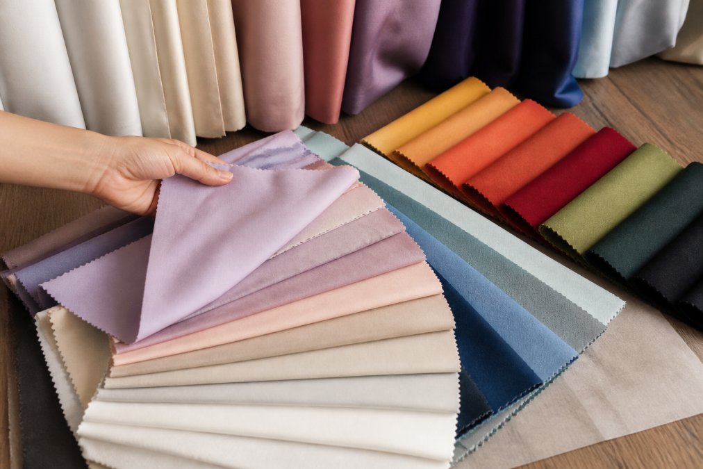
Seasonal trends influence what colors feel current and appropriate. Spring events feature soft pastels and fresh neutrals like blush pink, sage green, and soft cream. Summer events trend toward brighter, more saturated colors like coral, turquoise, and vibrant gold. Fall events gravitate toward warm, earthy tones, burnt orange, deep burgundy, warm gold, and chocolate brown. Winter events feature jewel tones, cool silvers, and deep metallics.
Color psychology shifts seasonally. Attendees expect certain color palettes during different seasons. A vibrant coral backdrop feels right in July but jarring in December. Currently, jewel tones and metallics dominate luxury events across all seasons, while neutrals remain consistently popular for corporate settings.
The best approach is choosing colors that align with your event's purpose and season while remaining timeless enough that photos won't feel dated in a few years. Avoid chasing trends so aggressively that your color choice feels gimmicky.
Selecting the right backdrop color requires balancing aesthetics, psychology, photography needs, and practical logistics. The best color options for event backdrops depend on your specific venue, lighting, attendee expectations, and brand identity. Event Drape Rental's extensive inventory of over 300 colors and multiple fabric materials means you can find exactly the right backdrop for your vision. Whether you need jewel tones for a luxury gala, neutrals for a corporate conference, or metallics for a contemporary celebration, our professional-grade drapes, available in heights from 12 to 30 feet, transform any space. Request a quote today and let our team help you bring your event's visual vision to life with the perfect backdrop color.
=== FAQ ANSWERS (audit these too, same rules) ===
[1] Q: What is the best color for a professional event backdrop? A: The best backdrop color depends on your event type and lighting. Neutral tones like gray, black, or white work universally and photograph well. For corporate events, navy or charcoal creates a polished, professional aesthetic. Jewel tones like emerald or sapphire add drama and sophistication. Consider your venue's lighting, colors appear differently under warm versus cool lighting. Test colors in your actual space before committing, or work with a rental company that offers color consultation to ensure your choice matches your event's visual goals.
[2] Q: How do I choose a corporate event color palette that complements my brand identity? A: Start by identifying your brand's primary and secondary colors, then build your backdrop choice around those. If your brand uses deep blues, select a backdrop in navy or charcoal that creates visual harmony. For high-contrast branding, choose a neutral backdrop and use metallic accents or custom graphics to showcase your logo. Consider color psychology: blues convey trust, greens suggest growth, and warm neutrals feel welcoming. If you need exact color matching, use Pantone color specifications when ordering custom drapes to ensure consistency across all event materials.
[3] Q: What colors work best for trade show displays and step and repeat backdrops? A: Trade show backdrops need high visual interest and strong contrast to attract attention. Black, navy, or charcoal backgrounds make logos and brand graphics pop. Metallic fabrics in gold or silver add a premium feel and reflect lighting, creating visual depth. For step and repeat displays, avoid colors too similar to your logo, contrast ensures your branding stands out in photos. Consider the surrounding booth environment; if competitors use dark backdrops, a jewel tone or matte finish in a contrasting color will differentiate your space and draw attendees.
[4] Q: How does lighting affect the appearance of backdrop colors? A: Lighting dramatically changes how backdrop colors appear. Warm lighting (2700K) makes jewel tones richer and neutrals feel cozier, while cool lighting (5000K) creates a crisp, modern look and can make some colors appear flat. Glossy finishes reflect light and create hot spots, while matte finishes absorb light and provide even color saturation. Test your backdrop color under the actual lighting setup planned for your event. If using stage lighting or uplighting, colors will shift, darker tones may look muddy, while lighter neutrals maintain clarity. Professional lighting design can enhance your backdrop's visual hierarchy and create the dramatic effect you want.
[5] Q: Are neutral or bold colors better for event photography output? A: Neutral backdrops (gray, white, black) are safer for consistent photography across all attendees and lighting conditions. They won't compete with subjects and ensure clear, professional photos. Bold jewel tones or metallics create more visually interesting photos with stronger color harmony, but require consistent lighting and positioning to look professional. For photo booth backdrops, neutrals with metallic accents offer the best balance, they photograph cleanly while adding visual interest. Consider your event's purpose: corporate events benefit from neutrals for professionalism, while weddings or celebrations can embrace bolder colors for memorable, distinctive photos.
Frequently Asked Questions
What is the best color for a professional event backdrop?
The best backdrop color depends on your event type and lighting. Neutral tones like gray, black, or white work universally and photograph well. For corporate events, navy or charcoal creates a polished, professional aesthetic. Jewel tones like emerald or sapphire add drama and sophistication. Consider your venue's lighting, colors appear differently under warm versus cool lighting. Test colors in your actual space before committing, or work with a rental company that offers color consultation to ensure your choice matches your event's visual goals.
How do I choose a corporate event color palette that complements my brand identity?
Start by identifying your brand's primary and secondary colors, then build your backdrop choice around those. If your brand uses deep blues, select a backdrop in navy or charcoal that creates visual harmony. For high-contrast branding, choose a neutral backdrop and use metallic accents or custom graphics to showcase your logo. Consider color psychology: blues convey trust, greens suggest growth, and warm neutrals feel welcoming. If you need exact color matching, use Pantone color specifications when ordering custom drapes to ensure consistency across all event materials.
What colors work best for trade show displays and step and repeat backdrops?
Trade show backdrops need high visual interest and strong contrast to attract attention. Black, navy, or charcoal backgrounds make logos and brand graphics pop. Metallic fabrics in gold or silver add a premium feel and reflect lighting, creating visual depth. For step and repeat displays, avoid colors too similar to your logo, contrast ensures your branding stands out in photos. Consider the surrounding booth environment; if competitors use dark backdrops, a jewel tone or matte finish in a contrasting color will differentiate your space and draw attendees.
How does lighting affect the appearance of backdrop colors?
Lighting dramatically changes how backdrop colors appear. Warm lighting (2700K) makes jewel tones richer and neutrals feel cozier, while cool lighting (5000K) creates a crisp, modern look and can make some colors appear flat. Glossy finishes reflect light and create hot spots, while matte finishes absorb light and provide even color saturation. Test your backdrop color under the actual lighting setup planned for your event. If using stage lighting or uplighting, colors will shift, darker tones may look muddy, while lighter neutrals maintain clarity. Professional lighting design can enhance your backdrop's visual hierarchy and create the dramatic effect you want.
Are neutral or bold colors better for event photography output?
Neutral backdrops (gray, white, black) are safer for consistent photography across all attendees and lighting conditions. They won't compete with subjects and ensure clear, professional photos. Bold jewel tones or metallics create more visually interesting photos with stronger color harmony, but require consistent lighting and positioning to look professional. For photo booth backdrops, neutrals with metallic accents offer the best balance, they photograph cleanly while adding visual interest. Consider your event's purpose: corporate events benefit from neutrals for professionalism, while weddings or celebrations can embrace bolder colors for memorable, distinctive photos.
This article was written using GrandRanker