 how-to
How to Choose Event Fabric Colors: A Guide
Table of Contents
- Understanding How Lighting Affects Event Fabric Colors
- Color Psychology in Event Design
- Seasonal Color Palettes for Events
- Best Fabric Materials for Event Backdrops
- How to Avoid Wrinkled Drapes for Event Rentals
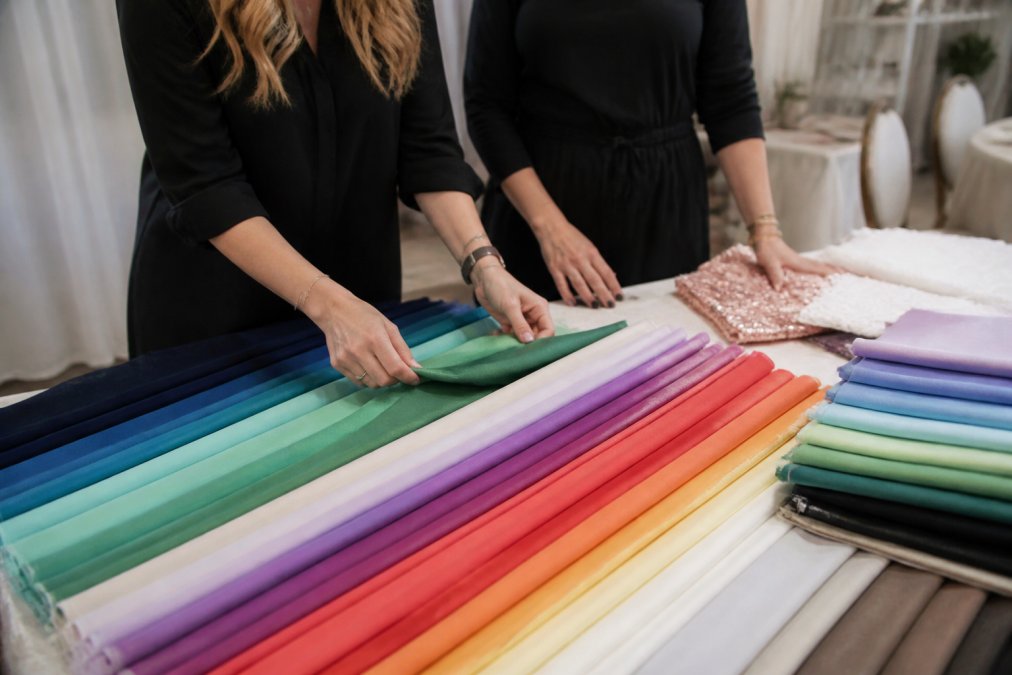
- Testing Fabric Samples and Matching Colors to Your Theme
- Accessibility and Color Contrast in Event Draping
- Choosing Event Fabric Colors: A Practical Framework
- Frequently Asked Questions
Last Updated: September 26, 2026
Understanding How Lighting Affects Event Fabric Colors
The color you see on your fabric sample at home won't look the same under your venue's lights. This is the single biggest mistake event planners make when choosing event fabric colors.
Light changes everything. A deep burgundy drape looks rich and warm under incandescent lighting but flat and dull under fluorescent bulbs. Natural daylight shifts the same fabric to an entirely different tone.
Fabrics reflect light rather than produce it. When the light source changes, so does the reflection. Professional event designers always test fabric samples in the actual venue before committing to a rental. Beyond the visual impact of color, the longevity of your installation depends on selecting durable fabrics that withstand the rigors of high-traffic event environments.
Here's what happens in practice:
- Warm lighting (incandescent, candles): Enhances reds, oranges, and yellows. Makes cool colors like blues and greens appear muted.
- Cool lighting (LED, fluorescent): Brings out blues and silvers. Makes warm colors feel less vibrant.
- Natural daylight: Reveals the true color as your eye perceives it outdoors. But it changes throughout the day.
- Mixed lighting: Creates uneven color zones across your drapes, which can look unprofessional.
Bring fabric samples to your venue at the same time of day your event will happen and view them under actual lighting conditions. This 15-minute step eliminates almost all color surprises on event day.
Color Psychology in Event Design
Colors trigger emotional responses in your guests. Understanding color psychology helps you choose event fabric colors that reinforce your event's mood and message.
Warm colors (reds, oranges, yellows) create energy and excitement, making spaces feel smaller and more intimate. Use them for networking events, product launches, or celebrations where you want high engagement.
Cool colors (blues, greens, purples) feel calming and professional, making spaces feel larger and more open. Use them for corporate conferences, formal galas, and upscale weddings.
Neutral colors (blacks, whites, grays, beiges) provide flexibility. They let your lighting design and décor take center stage. Neutrals work for any event type because they don't compete for attention.
Your fabric sets the tone before anyone speaks. A bright red drape says "bold and energetic," deep navy says "professional and trustworthy," and soft blush pink says "elegant and romantic."
Many planners pick colors they like personally instead of colors that serve the event's purpose. The goal is to choose event fabric colors that reinforce what you're trying to communicate to your guests.
Formal corporate events call for different color psychology than casual celebrations. A black-tie gala needs authority and elegance; a summer outdoor picnic needs approachability and warmth.
Seasonal Color Palettes for Events
The season of your event influences which colors work best. Seasonal palettes feel natural to guests because they align with what people expect to see at that time of year.
Spring (March-May): Soft pastels like blush pink, sage green, pale yellow, and light lavender feel fresh and new. Consider sheer or semi-transparent materials to let light pass through.
Summer (June-August): Bright, saturated colors like coral, turquoise, sunny yellow, and vibrant green feel energetic and fun. Darker jewel tones like emerald and sapphire work well for evening galas.
Fall (September-November): Deep, warm tones like burgundy, burnt orange, deep gold, chocolate brown, and forest green feel cozy and sophisticated.
Winter (December-February): Cool, dramatic colors like silver, navy, deep purple, and jewel tones feel festive and formal. Metallics like gold and copper add warmth without feeling out of season.
Seasonal colors feel expected and harmonious, making your event feel more polished and intentional.
That said, don't let seasonality trap you. If your brand is bright turquoise and your event happens in November, use turquoise. The goal is to balance seasonal expectations with your event's specific identity.
Best Fabric Materials for Event Backdrops
The fabric material you choose affects how colors appear and how your drapes perform. Different materials have different textures, sheens, and light-reflecting properties.
Polyester is the most common choice for event rentals. It's durable, affordable, has a slight sheen that makes colors pop, resists wrinkles, and cleans easily.
Velvet creates rich, luxurious color depth with the pile absorbing light. The downside: it shows wrinkles and dust more visibly and requires careful handling.
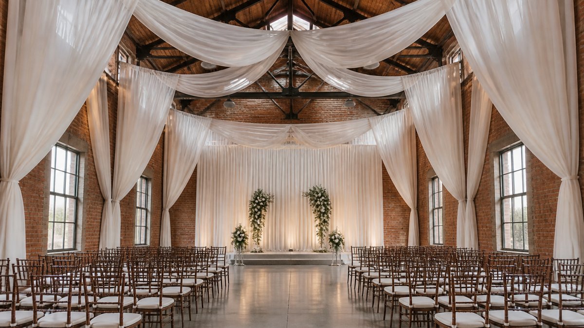
Organza is sheer and lightweight, allowing light to pass through while adding subtle color. It's ideal for romantic events, weddings, and sophisticated galas.
Silk offers elegance and natural drape with vibrant, refined colors. It's premium-priced and typically reserved for high-end weddings and formal events.
Linen provides texture and a natural, organic feel with a matte finish. It works well for rustic, casual, or eco-conscious events.
Cotton blend offers affordability and breathability. It has a matte finish similar to linen. Cotton blends work for casual events, outdoor celebrations, and trade shows where a more relaxed look fits the vibe.
When choosing fabric materials, consider both aesthetics and practicality. Velvet looks incredible but requires more care; polyester is forgiving and versatile; organza creates visual magic but needs thoughtful layering.
How to Avoid Wrinkled Drapes for Event Rentals
Wrinkled drapes kill the professional look of any event. They read as careless or budget-conscious, which undermines your entire design. The good news: wrinkles are preventable with the right approach.
Storage and delivery matter most. Drapes stored loosely or folded tightly develop creases. Professional rental companies use proper storage methods to minimize wrinkles.
Testing Fabric Samples and Matching Colors to Your Theme
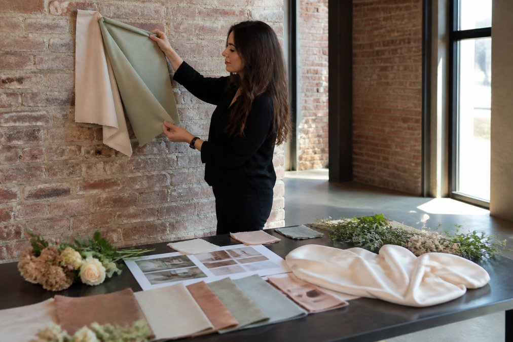
This is where theory meets reality. You've chosen your colors based on psychology and season. Now you need to verify they actually work in your specific venue with your specific lighting.
Accessibility and Color Contrast in Event Draping
Color choices matter for everyone at your event, including guests with color blindness or low vision. Accessibility isn't an afterthought, it's part of professional event design.
Avoid problematic color combinations:
- Red and green together (most common color blindness)
- Blue and yellow in small patterns (harder to distinguish)
- Light colors on light backgrounds (poor contrast)
- Dark colors on dark backgrounds (poor contrast)
Choosing Event Fabric Colors: A Practical Framework
You've learned the theory. Now here's a step-by-step process to choose event fabric colors for your specific event.
Step 1: Define your event's purpose and mood.
- What message do you want to communicate? (Professional, celebratory, romantic, energetic, formal, casual)
- Who is your audience? (Corporate executives, families, young professionals, mixed)
- What season is your event?
Step 2: Identify 3-5 candidate colors.
- Use color psychology principles (warm for energy, cool for calm, neutrals for flexibility)
- Consider seasonal palettes
- Think about your brand colors if this is a branded event
- Avoid more than 3 primary colors, complexity reads as chaotic
Step 3: Research fabric materials.
- Decide between polyester (versatile), velvet (luxe), organza (romantic), silk (elegant), linen (natural), or cotton blend (casual)
- Consider wrinkle resistance and maintenance needs
- Think about how each material reflects light and shows color
Step 4: Request samples from your rental company.
- Order samples of your top choices
- Confirm they have adequate inventory of your chosen colors
- Ask about availability and pricing
Step 5: Test in your venue.
- Visit with samples at the time of day your event will happen
- Evaluate under the venue's lighting
- Test with any custom lighting you're planning
- Photograph for reference
Step 6: Coordinate with other décor.
- Compare your drape colors to florals, linens, signage, and lighting
- Ensure high contrast for readability and accessibility
- Verify color harmony across all design elements
Step 7: Confirm your order.
- Lock in your color choice with your rental company
- Confirm delivery date, setup time, and any professional installation
- Ask about wrinkle prevention and care during delivery
Frequently Asked Questions
How does lighting affect the appearance of event fabric colors?
Lighting dramatically changes how fabric colors appear. Artificial lighting with lower color rendering index (CRI) can distort warm tones and make colors appear duller. Natural light reveals true color saturation and hue. Warm-toned artificial lighting shifts colors toward orange and yellow, while cool-toned lighting pushes them toward blue. Always test fabric samples under the exact lighting conditions of your venue, both natural and artificial, to see the actual color you'll get on event day.
What's the best way to choose event fabric colors that match my theme?
Start by defining your event theme and identifying 2-3 primary colors and 1-2 secondary colors. Pull inspiration from your venue's existing features, walls, flooring, architectural elements. Create a color palette that either complements or contrasts with these elements depending on your design intent. Test fabric swatches in your venue under both natural and artificial lighting. Consider the mood you want to create: bold colors energize corporate events, while softer tones suit intimate weddings. Ensure sufficient contrast for accessibility if your event includes presentations or displays.
Which fabric materials work best for event backdrops?
Polyester is durable, affordable, and resists wrinkles well, making it ideal for rental situations. Organza offers elegance and light diffusion for dramatic effects but requires careful handling. Silk provides luxury appearance and rich color saturation but demands professional care. For high-traffic corporate events and trade shows, polyester blends offer the best balance of durability, color accuracy, and ease of maintenance. Consider your venue height, installation method, and how the fabric will interact with lighting when selecting materials.
How can I avoid wrinkled drapes for event rentals?
Request delivery with adequate setup time before your event so drapes can hang and naturally release wrinkles. Polyester fabrics resist wrinkles better than natural fibers. When drapes arrive, hang them immediately and let gravity work for several hours. Avoid folding or crushing them during transport or storage. Professional installation services typically include proper hanging techniques that minimize visible wrinkles. If wrinkles persist, steam or iron on low heat, or request professional pressing from your rental company before delivery.