 how-to
How to Choose Trade Show Booth Colors That Get Noticed
Last Updated: October 31, 2026
Quick Summary
Start with your brand colors and your show goal, then build a palette of three to four colors: a dominant color, a neutral, and one accent. Test that palette under venue lighting and check contrast before you commit to trade show booth colors.
- Pull two or three colors from your logo, website, and sales materials as your starting point.
- Match your color direction to one goal, such as launching a product or booking meetings.
- Keep the palette to three or four colors and use one accent for calls to action.
- Aim for a text contrast ratio of about 4.5:1, and push toward 7:1 for headlines.
- Test swatches under the venue's lighting and never rely on red versus green alone.
Table of Contents
- Start With Your Brand Colors and Show Goals
- Trade Show Booth Color Psychology: What Each Hue Signals
- Warm, Cool and Neutral Palettes for Your Booth
- Trade Show Booth Color Schemes That Work on the Show Floor
- How Trade Show Booth Lighting Changes Your Colors
- Test, Check Contrast and Avoid Common Color Mistakes
- Booking Your Drapes and Backdrop Colors With Event Drape Rental
- Frequently Asked Questions
Start With Your Brand Colors and Show Goals
Your trade show booth colors decide whether attendees stop or walk past.
Start with your brand colors. Pull up your logo, your website, and your sales materials. Note the two or three colors that show up again and again.
Then write down one goal for the show. Are you launching a product, booking meetings, or building name recognition? Each goal points to a different color direction.
- Launching a product: Bold, high-contrast colors draw attention fast.
- Booking meetings: Calm, clean colors make people feel welcome to stay.
- Building awareness: Your brand's signature color should lead.
Trade Show Booth Color Psychology: What Each Hue Signals
Color carries meaning before anyone reads a word, so your trade show booth colors send a message before a visitor reads a single sign. Red signals energy and urgency.
Use these signals on purpose. A financial services firm may want blue to build trust. A fitness brand may choose orange for energy.
Watch out: Bright red can feel loud and aggressive in a small space. Test it before you commit to a full wall.
Warm, Cool and Neutral Palettes for Your Booth
Warm colors like red, orange, and yellow advance toward the viewer. They fill space and feel lively. Cool colors like blue, green, and purple recede. They feel calm and open.
Neutrals like white, gray, and black give your brand colors room to breathe. A neutral base with one or two accent colors is one of the most reliable setups on the show floor.
- Warm palette: Best for energetic brands and fast-paced demos.
- Cool palette: Best for technology, healthcare, and professional services.
- Neutral palette: Best for brands with strong logos or product photography.
Trade Show Booth Color Schemes That Work on the Show Floor
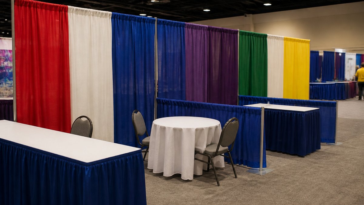
A good color scheme usually has three parts: a dominant color, a supporting color, and an accent. The dominant color covers the most space. The accent draws the eye to key messages.
Keep the palette tight. Three to four colors is plenty. More than that and the booth starts to look busy.
Here is a simple way to build one:
- Pick your dominant color from your brand palette.
- Choose a neutral for backgrounds and fabric.
- Add one accent color for calls to action and signage.
Our drape colors cover over 100 options, so you can match your palette exactly.
How Trade Show Booth Lighting Changes Your Colors
Lighting changes how every color looks, and convention halls can be unpredictable lighting environments. The same navy drape can read rich and deep in one aisle and flat and gray in the next. Understanding why, and testing for it, is what separates a palette that works on paper from one that works on the floor.
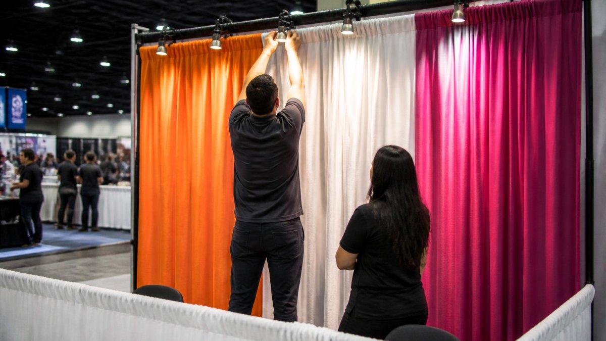
Two lighting properties that move your colors
Color temperature describes how warm or cool a light source is, measured in kelvin (K). Warm white bulbs, often around 2700K to 3000K, push reds and oranges toward a glow and can make blues look muddy.
Color rendering describes how faithfully a light source shows color, measured by the color rendering index (CRI) on a 0-100 scale. A source with a high CRI shows colors close to how they look under daylight; a low-CRI source can mute or distort them.
What this means for fabric and finish
- Dark fabrics absorb light. Black, navy, and burgundy drapes need brighter or more targeted spotlights to keep their depth; without enough light they can read as flat gray.
- Light fabrics reflect light. White and light gray can look washed out under harsh overhead lamps, and they bounce light onto nearby surfaces, which can tint your accent colors.
- Saturated colors shift most. A bright red or royal blue is more sensitive to color temperature than a neutral, so test saturated swatches under the specific bulbs you expect.
- Screens and backlit graphics behave differently. A color that looks right printed on fabric may look over-bright on an LED wall, because screens emit light rather than reflect it.
Test under the lights you expect
Ask the venue or your exhibit house what lighting the hall uses, color temperature and, if available, CRI. Then replicate it as closely as you can before the show:
- Borrow or buy the right bulbs. A warm-white and a cool-white bulb are inexpensive; view your fabric swatches under each.
- Set up a mini mockup. Hang a swatch of your dominant drape, place a sample sign in front of it, and light it the way you plan to light the booth.
- Check at show distance. Step back 15 to 20 feet and confirm the palette still reads.
- Photograph under each light. Compare the photos side by side; the camera exaggerates shifts your eye may forgive.
Plan lighting as part of the palette
Treat lighting as a color decision, not an afterthought. If your palette depends on a deep navy or a rich burgundy, budget for spotlights that can carry it. If you are renting drapes, ask whether the fabric is available in a matte or sheen finish, sheen reflects more light and can change the perceived color under directional fixtures. A short conversation with your rental provider about the venue's lighting, plus a swatch test under matching bulbs, prevents the most common show-floor surprise: a booth that looked perfect in the sample book and wrong under the hall lights.
Test, Check Contrast and Avoid Common Color Mistakes
Before you commit, test your colors, and test them against a standard, not just your taste. Two things sink booth palettes more often than bad hue choices: unreadable contrast and colors that fail for visitors with color-vision deficiency.
Check contrast with a real number
Accessibility guidelines commonly recommend a minimum contrast ratio of about 4.5:1 for normal-size text against the background (Understanding Success Criterion 1.4.3: Contrast (Minimum) | WAI).
You don't need design software to check. Achieving this visual clarity is only the first step in your booth design, as the emotional resonance of your palette ensures that color psychology matters when you want to influence attendee behavior.
Design for color-vision accessibility
Red-green color-vision deficiency is the most common form of color blindness, affecting a meaningful share of viewers (Color Blindness). That means a palette that relies on red versus green to separate "stop here" from "keep moving" will fail for a meaningful share of your audience.
Three practical rules:
- Never use color alone to carry meaning. Pair every color-coded cue with a label, an icon, or a shape. If a red zone means "demo" and a green zone means "sales," add text signs, not just colored flooring.
- Lean on value contrast, not hue contrast. Light versus dark reads clearly for nearly everyone; red versus green does not. A navy background with white type survives color-vision deficiency. A red background with green type does not.
- Avoid the classic traps. Red/green, blue/purple, and green/brown pairings are the most frequently confused. If your brand palette forces one of these, separate the colors with a neutral border or a value shift.
Run a real pre-show test
Print swatches or order fabric samples and view them next to your logo, your signage proofs, and a photo of your product. Then stress-test the palette:
- Morning, afternoon, and evening light. View samples near a window and under the bulbs you expect at the venue.
- At distance. Tape the swatch and a sample sign to a wall and step back 15 to 20 feet, the distance a passing attendee will see them.
- On a phone screen. Photograph the samples and view the images on a phone, because many attendees will first see your booth through a screen.
- Next to a neighbor. Place your swatch beside a bright competitor color to see whether your palette still holds attention.
Common mistakes to avoid
- Using too many bright colors at once
- Choosing colors that clash with your logo
- Ignoring how lighting changes the look
- Picking a color because it looks good on a screen, not in person
- Relying on color alone to signal information
- Skipping a contrast check on signage and screen content
A palette that passes these checks is not just prettier, it is readable, inclusive, and more likely to convert a passing glance into a stop.
The article's contrast and color-vision guidance can be summarised in a quick reference table.
| Check | Target or rule | Note |
|---|---|---|
| Text contrast ratio | About 4.5:1 minimum | Normal-size text against background |
| Hero message contrast | Push toward 7:1 | For headlines read from distance |
| Viewing distance test | 15 to 20 feet | Distance attendees will read signs |
| Red-green pairing | Avoid | Common color-vision deficiency trap |
| Color-coded cues | Pair with label or icon | Never rely on color alone |
| Pre-show test | Morning, afternoon, evening light | Plus venue bulbs and phone screen |
Booking Your Drapes and Backdrop Colors With Event Drape Rental
Once you know your palette, the next step is getting the fabric. Event Drape Rental offers pipe and drape in over 100 colors and six fabric types, with heights from 12 to 30 feet. You can choose DIY setup or professional installation.
To learn more about who stands behind the rental, visit our company page. When you are ready to see the full range of colors and fabrics, browse the main rental page. For a quick, direct price on your booth, request a drape quote.
Once you have your colors set, you can also read our guide to choosing event fabric colors for more detail on warm, cool, and neutral palettes.
Frequently Asked Questions
How do you choose colors for a trade show booth?
Start with your brand palette, then pick one dominant color, one accent and one neutral. Confirm the choice against your show goals, such as attracting attention or signaling a premium feel. Check the palette in the venue's own lighting before committing, because fixtures can shift hues noticeably. Pipe and drape from Event Drape Rental comes in more than 100 colors, so you can match brand guidelines closely. Request a quote to confirm which shades are currently in stock.
What colors attract attention at a trade show?
Bold, saturated colors such as red, orange and bright blue tend to stand out against the neutral carpeting and gray walls common on show floors. Contrast matters more than hue alone: a dark color next to a light one reads from farther away. Avoid placing several bright colors together, since they compete for attention. Pair one vivid accent with a calm background so attendees know where to look first.
How many colors should a trade show booth use?
Most booths work well with three colors: a primary for large surfaces, a secondary for panels and graphics, and an accent for calls to action. Using more than four tends to make the booth look busy and dilutes your brand. Keep the palette consistent across drapes, graphics and furniture. If you need precise brand matches, confirm the shades you plan to use before finalizing the design.
How can lighting affect trade show booth colors?
Show floor lighting is often warm or uneven, which can make blues look gray and whites look yellow. Test your fabric and graphic colors under the venue's lighting, or ask the organizer for lighting specifications in advance. Spotlights can intensify a color, so a shade that looks subtle in a studio may appear much bolder on the floor. Adjust your choices before the show rather than after setup.
Your booth colors should match your brand, support your goal, and hold up under real show lighting. Get those three right and your space will stand out on the floor. Contact Event Drape Rental today to request a quote for drapes in the exact colors your brand needs.